


  |

 Jun 19 2007, 21:46 Jun 19 2007, 21:46
Post
#21
|
|
 Administrator Group: Root Admin Posts: 693 Joined: 10-October 06 From: Toulouse, France Member No.: 1 |
QUOTE Not everything needs to stick out to a maximum level (if you consider 0% opacity flat, and 100% opacity like hitting the ceiling). You need relief. (Relief = 1. prominence, distinctness, or vividness due to contrast. 2. the projection of a figure or part from the ground or plane on which it is formed, as in sculpture or similar work. 3. an apparent projection of parts in a painting, drawing, etc., giving the appearance of the third dimension. In this case) Didn't get the point here but yeah I agree with opacity, will change it *Edit* Done --------------------   |
|
|
|


|
Jun 19 2007, 23:34
Post
#22
|
|
 Hipster addonmaker  Group: Former .info Serviceman Posts: 2,090 Joined: 1-November 06 From: Kingdom of the Netherlands Member No.: 10 |
QUOTE(Cervo @ Jun 19 2007, 22:46)  Didn't get the point here but yeah I agree with opacity, will change it *Edit* Done I was trying to make a comparison towards 3D (thinking in 3D often helps people understand problems better). This is essentially the same theory that makes normal/bump maps possible. For all the graphics-geeks: In the spectrum from bright (white) to dark (black), the way the colors used interact with the surrounding is called contrast. If the contrast of your website, or elements of it is too much leaned towards either of the two extremes, physical discomforts may occur, these range from headaches, painfull eyes or quite simply being irritated of having a hard time reading things. This is why it may look cool to make a website using #FFFFFF (pure white) and #000000 (pure black), but it is not user-friendly at all. Alot of tricks that involve cheating or tiring the eyes involve extreme contrasts. Making peoples eyes hurt is not what any webdesigner would want to do.  Ideally the contrast would always be between the levels marked by "1" and "2". If the contrast is any sharper, the effectiveness of contrast is lost. This is also true for color combinations. Some combinations are just simply "no-no's". A good way to judge whether or not colors are suited to be used in combination with eachother is to look at the color spectrum (colors that oppose eachother on the spectrum will generally make good combinations). One way of achieving user-friendly envirnments is through the use of colors that make good combinations (like you did with the forum), another is through the use of opacity levels (to make sharp contrasts blend in more). 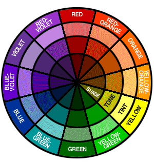 The contrast was not that bad in the picture, I was talking theoretically. I thought some Dictionary.com could explain things easier then I could 
-------------------- Creator of dodgy ArmA:CWA addons.   |
|
|
|


|
Jun 20 2007, 08:42
Post
#23
|
|
|
Administrator Group: Root Admin Posts: 693 Joined: 10-October 06 From: Toulouse, France Member No.: 1 |
Thanks for explanation! Incredible that you have so much free time in your hands to make such long texts
-------------------- |
|
|
|
|
Jun 20 2007, 10:26
Post
#24
|
|
|
Hipster addonmaker Group: Former .info Serviceman Posts: 2,090 Joined: 1-November 06 From: Kingdom of the Netherlands Member No.: 10 |
QUOTE(Cervo @ Jun 20 2007, 09:42) Incredible that you have so much free time in your hands to make such long texts You should see some of my contributions to political threads, or PM's complaning about the soft moderating (towards certain people) on BIS forums
-------------------- Creator of dodgy ArmA:CWA addons. |
|
|
|
|
Jun 20 2007, 11:10
Post
#25
|
|
|
Administrator Group: Root Admin Posts: 693 Joined: 10-October 06 From: Toulouse, France Member No.: 1 |
Politicals threads? yeah, you couldn't find a better way to totally waste your time, unless doing some IRC in #ofpec channel
-------------------- |
|
|
|
|
Jun 20 2007, 12:21
Post
#26
|
|
|
Hipster addonmaker Group: Former .info Serviceman Posts: 2,090 Joined: 1-November 06 From: Kingdom of the Netherlands Member No.: 10 |
QUOTE(Cervo @ Jun 20 2007, 12:10) Politicals threads? yeah, you couldn't find a better way to totally waste your time, unless doing some IRC in #ofpec channel That channel is the most useless ever, it's like the few people that hang out there are completely drunk all the time...  Luckily enough right here we only have mental cases, not alcoholics (well, except for Wittmann). -------------------- Creator of dodgy ArmA:CWA addons. |
|
|
|
|
Jun 20 2007, 22:00
Post
#27
|
|
|
Administrator Group: Root Admin Posts: 693 Joined: 10-October 06 From: Toulouse, France Member No.: 1 |
QUOTE That channel is the most useless ever, it's like the few people that hang out there are completely drunk all the time... I didn't mean this, I had some great chat there but you start chatting and when you look at your watch a few minutes later, 4 hours have disapeared! -------------------- |
|
|
|
|
Jun 20 2007, 22:53
Post
#28
|
|
|
Hipster addonmaker Group: Former .info Serviceman Posts: 2,090 Joined: 1-November 06 From: Kingdom of the Netherlands Member No.: 10 |
QUOTE(Cervo @ Jun 20 2007, 23:00) I didn't mean this, I had some great chat there but you start chatting and when you look at your watch a few minutes later, 4 hours have disapeared! Pretty much the same thing as chatting with you, only without the satisfaction  I get the same thing when I open 3DS MAX, Photoshop or Painter though. -------------------- Creator of dodgy ArmA:CWA addons. |
|
|
|
|
Jun 21 2007, 07:58
Post
#29
|
|
 ArmA.info Sarcasm Society's Admin Extraordinaire Group: Administrators Posts: 907 Joined: 5-November 06 From: Canberra, Australia Member No.: 18 |
Bit off topic arent we lads?
 This isnt the room for idle chatter you have PMs for that! And I agree with JdB the images with opacity added to denote that the file/image is not avail. works alot better, nice work 
-------------------- |
|
|
|


 |
3 User(s) are reading this topic (3 Guests and 0 Anonymous Users)
0 Members:
| Lo-Fi Version | Time is now: 25th April 2024 - 14:05 |